Brand
Four marks on one grid, with one ink and one accent.


Marks
Every mark spans the same 16 units of a 20-unit box, so the four line up at any size.
Lattices
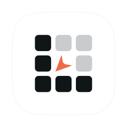
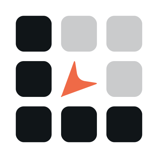
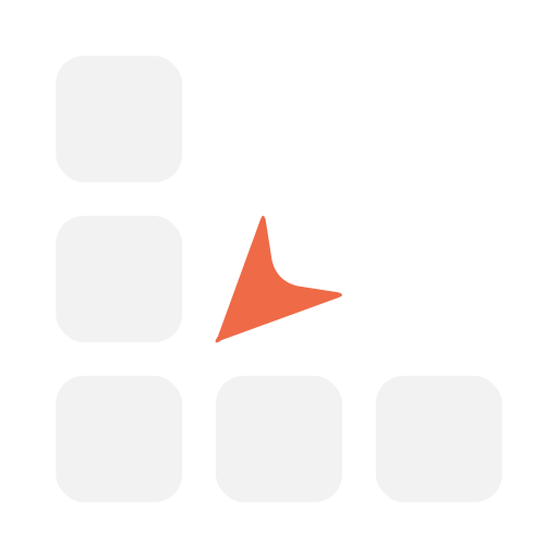
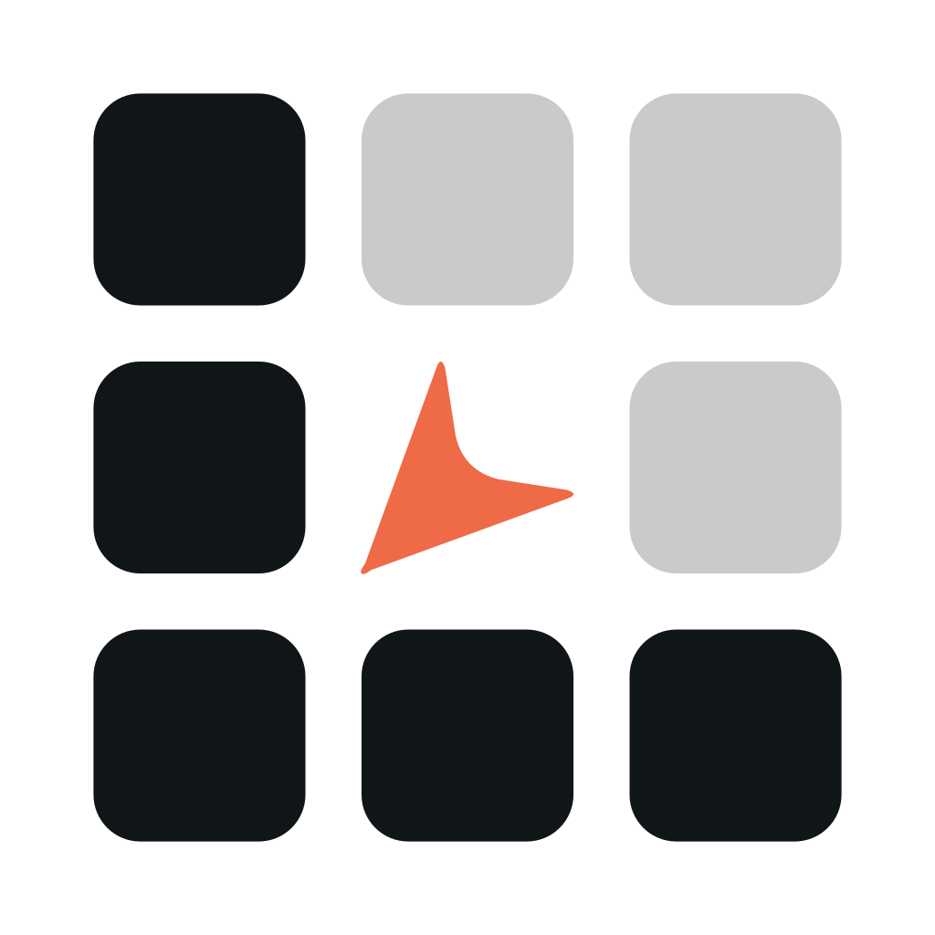
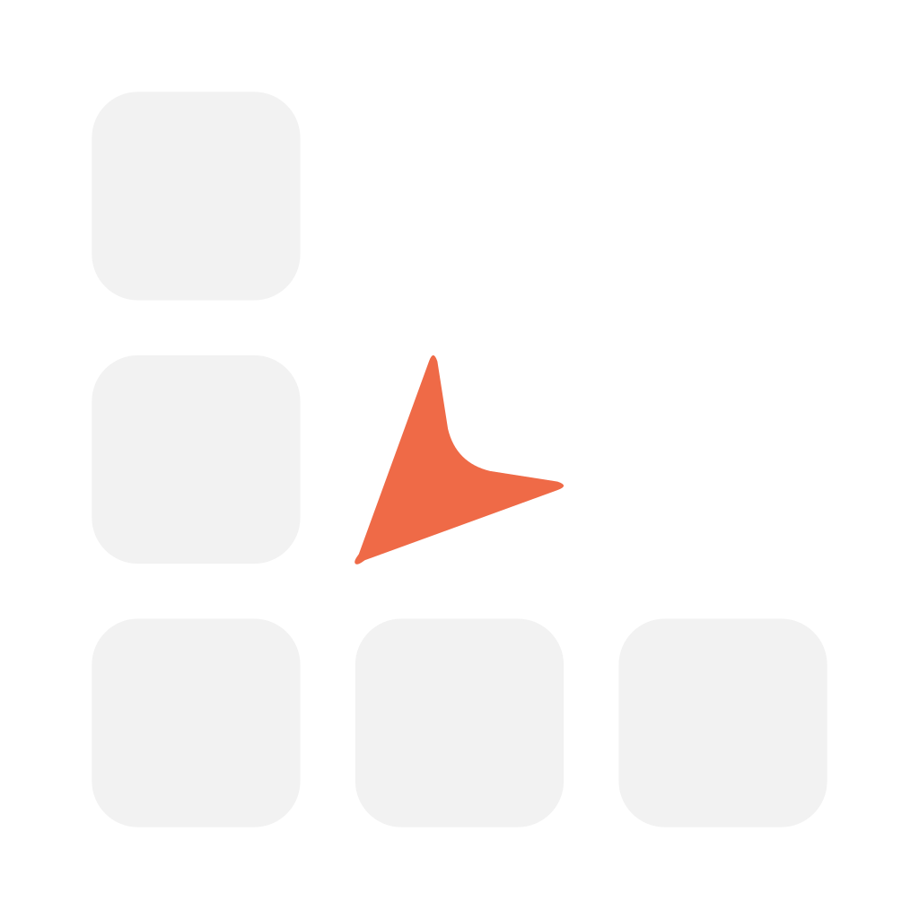
The L of a 3 × 3 grid, with Action's cursor in the centre and its tip in the crook of the L: Lattices puts a window where you point.


Action
An A that fills its square, with the cursor on its diagonal: the tip on the counter's edge, the tail on the square's right and bottom sides.


Blink
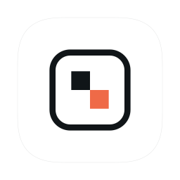
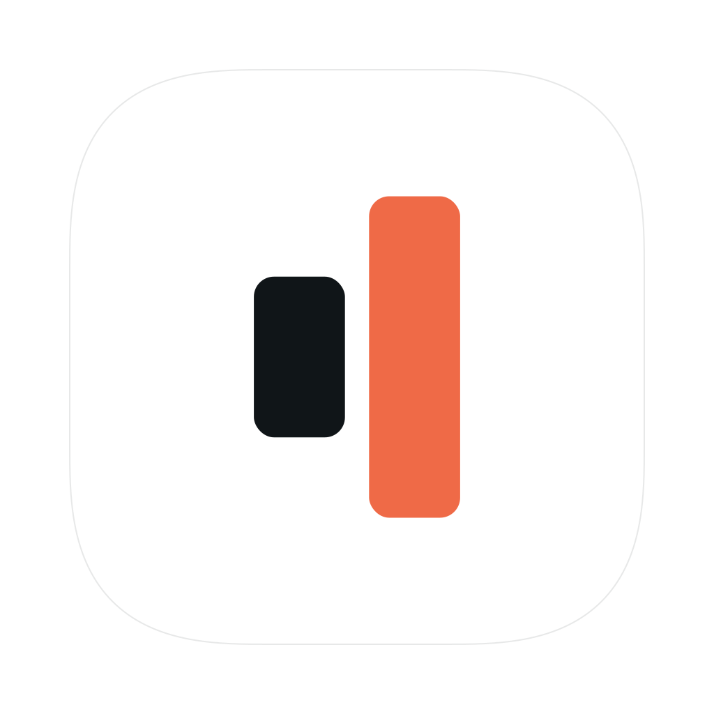
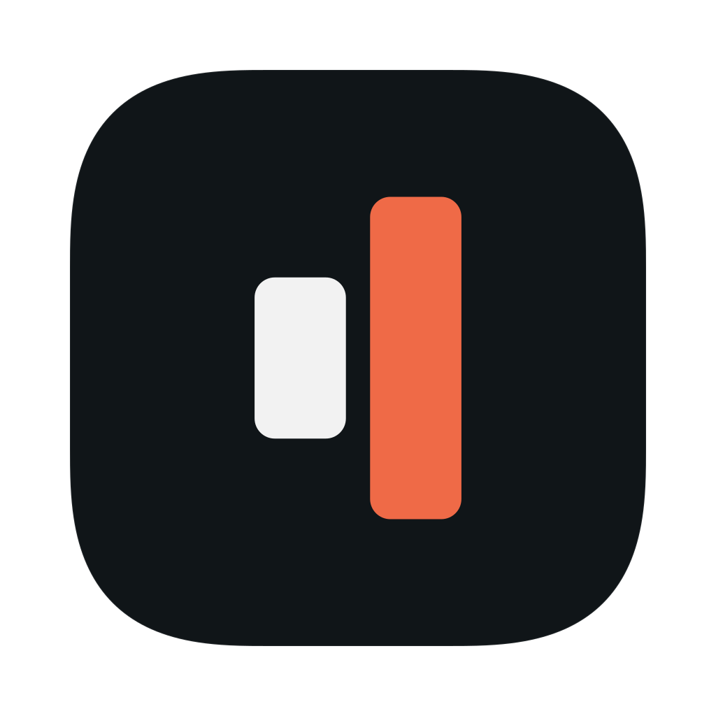
A panel frame with two blocks stepping across it. The front block, the note in hand, carries the accent.
Speech
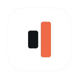
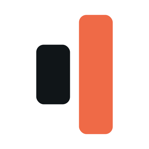
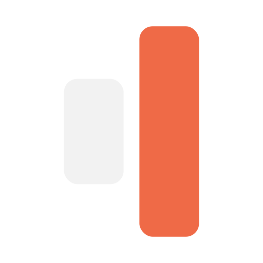
Two waveform bars frozen at the playhead: the word just spoken and the one sounding now. Short then tall, they also draw a speaker.
One accent
Coral#ef6a47
- On white
- 3.08:1
- On #101518
- 5.97:1
Coral also means live in Action's menu bar.
- LatticesThe pointer taking aim
- ActionThe cursor
- BlinkThe note in hand
- SpeechThe word sounding now
Centres
The pointer is the Lattices centre. A surface swaps in another with centre only while Lattices does that job there.
Pointer
Action's cursor with its tip in the crook of the L. The default.AimKnob
A knob on the dim cell: the spot to let go.ReleaseSweep
A quarter turn pivoting on the crook: a tile swinging into place.MoveBracket
The L again at small scale: a workspace inside the workspace.SessionNode
A joint in the lattice: connected and running.Live
App icons
| Product | 16 | 32 | 64 | 128 |
|---|---|---|---|---|
| Lattices |  |  |  |  |
| Action |  |  |  |  |
| Blink |  |  |  |  |
| Speech |  |  |  |  |
| Product | 16 | 32 | 64 | 128 |
|---|---|---|---|---|
| Lattices |  |  |  |  |
| Action |  |  |  |  |
| Blink |  |  |  |  |
| Speech |  |  |  |  |
Favicons
Browser tabs
 Lattices — the programmable workspace for Mac
 Action — computer use from Lattices
 Blink — spatial notes from Lattices
 Speech — a standalone player from Lattices
- Lattices — the programmable workspace for Mac
- Action — computer use from Lattices
- Blink — spatial notes from Lattices
- Speech — a standalone player from Lattices
Touch icons


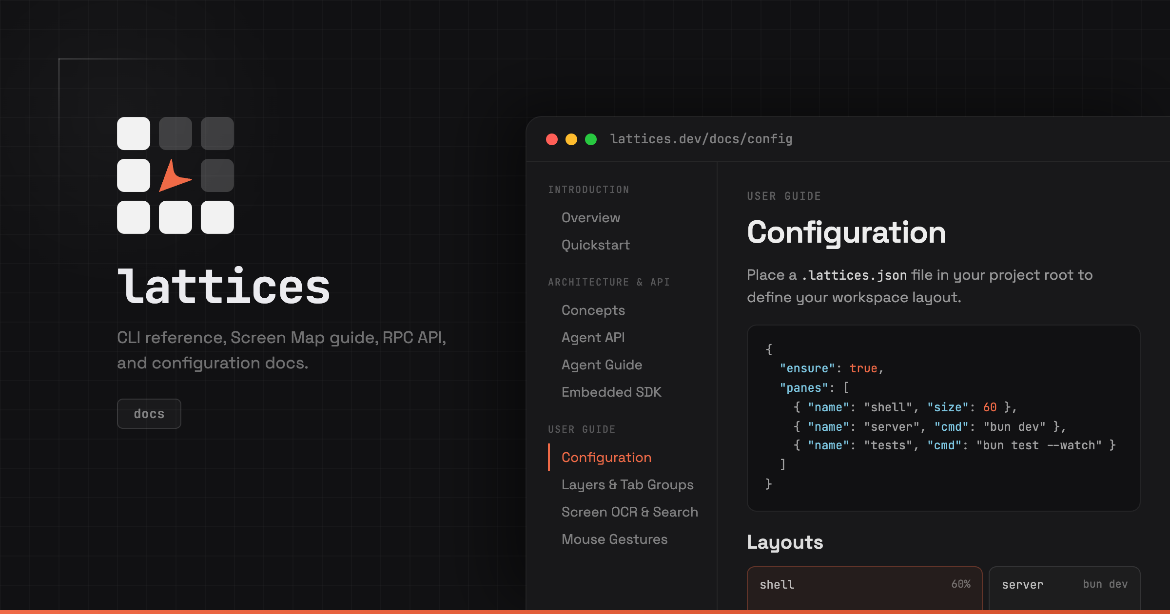
Open Graph
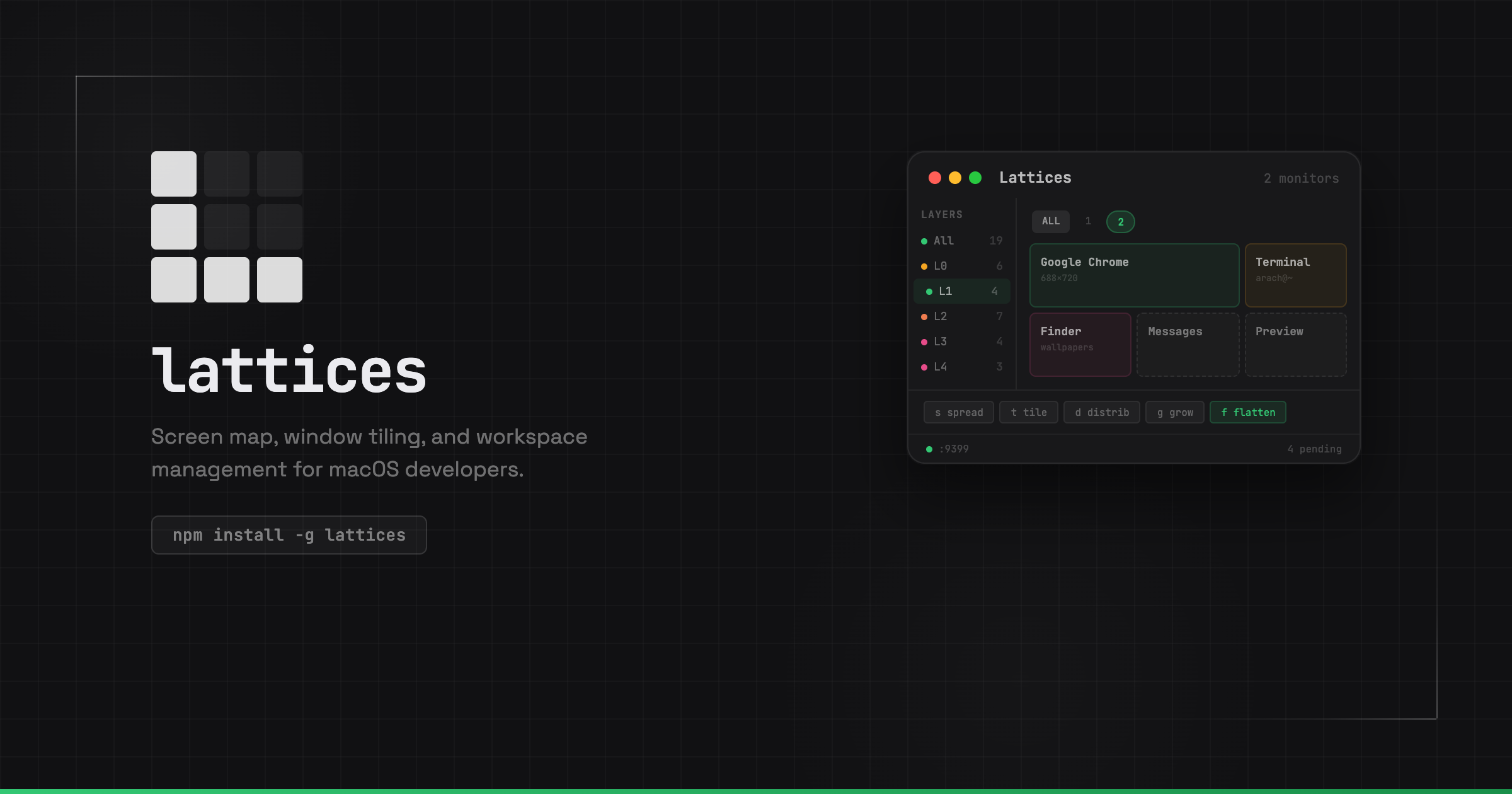
- Card
- 1200 × 630 on a 30 px grid, exported at 2×.
- Mark
- Cropped to the glyph bounds in its kit's README and fitted to a 120 px box at (120, 120).
- Copy
- Title 30 px under the mark, then subtitle and tag, in a 360 px column.
- Preview
- From (540, 120) off the right and bottom edges, 660 × 510 visible.
- Family
- Action, Blink and Speech only: the Lattices mark and name, 60 px above the bottom edge.
- Accent
- Each mark keeps its coral. A 4 px bar runs along the bottom edge, #ef6a47 to #d4502c, on every card.
Cards
/
/docs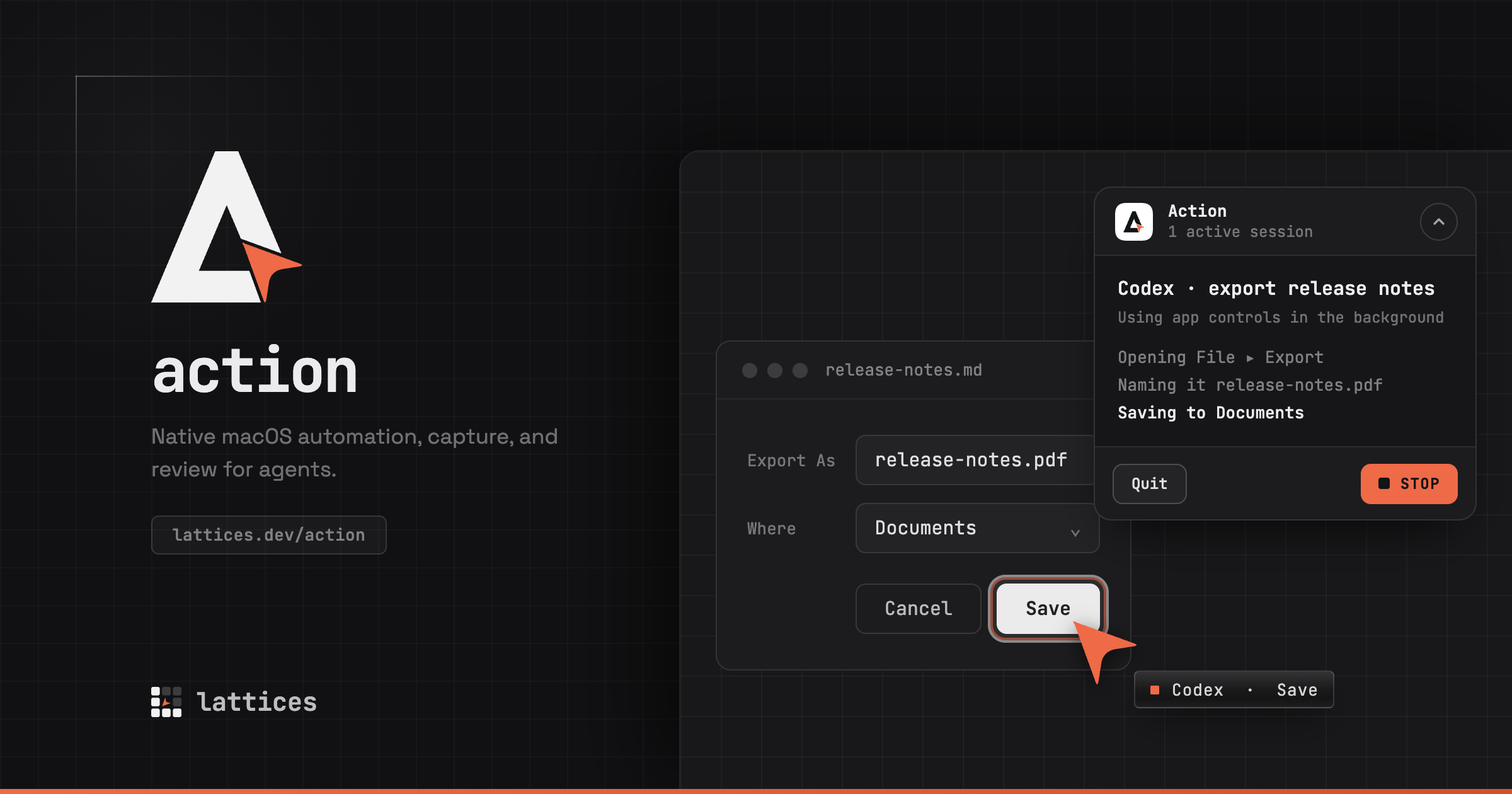
/action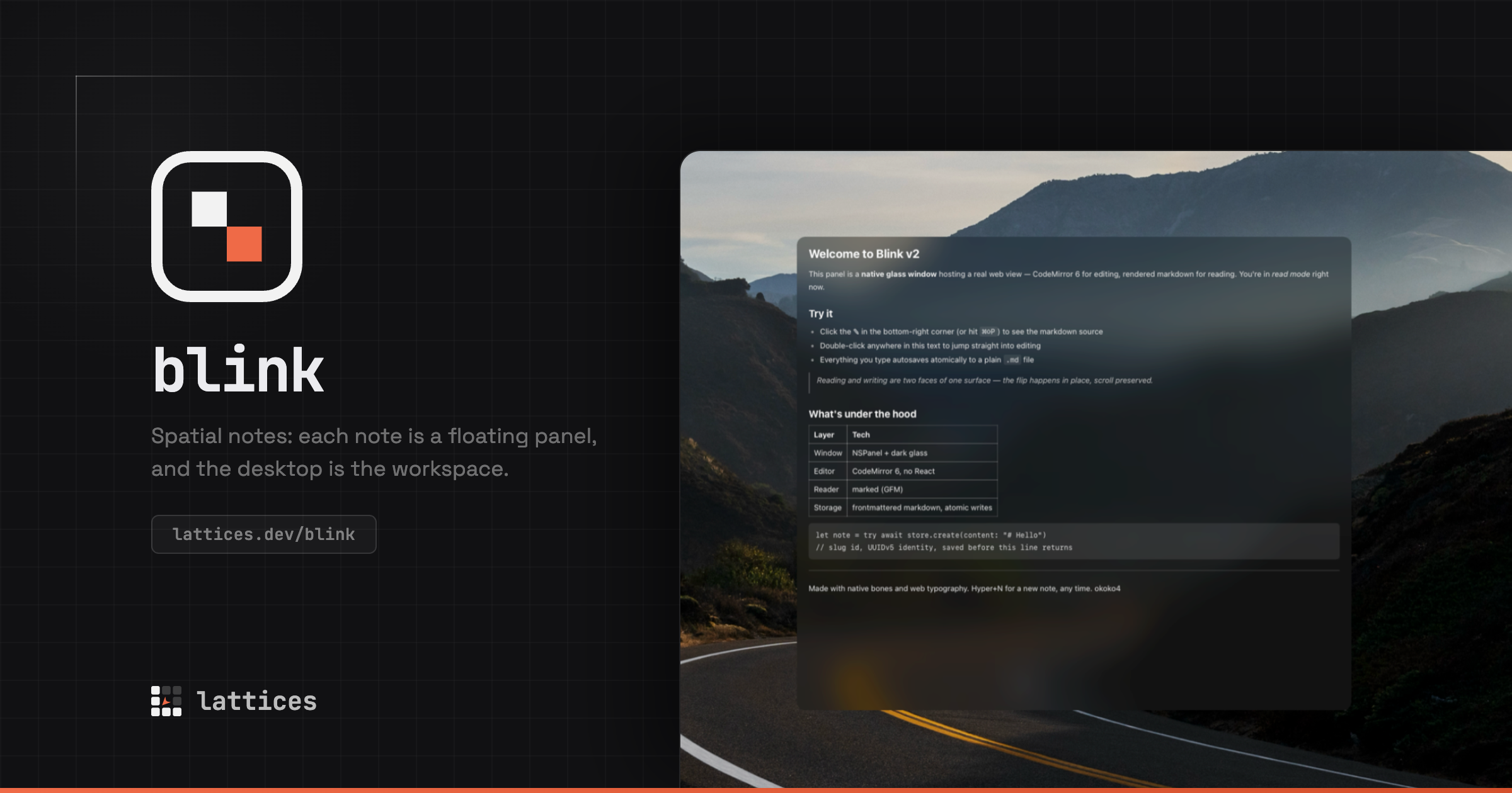
/blink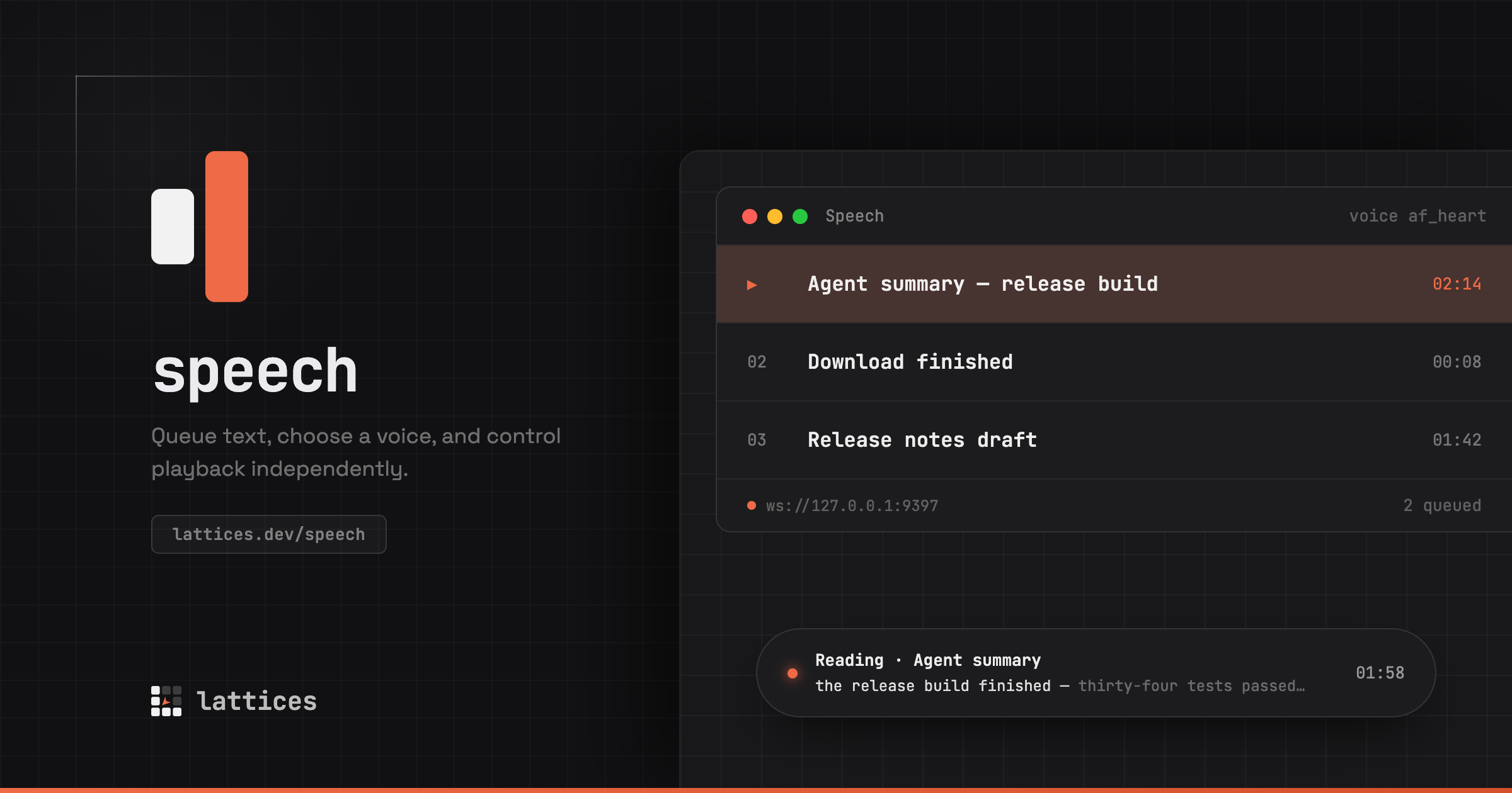
/speech
Colour
Every mark
- Ink on light
#101518 - Ink on dark
#f2f2f2 - Accent, both themes
#ef6a47
Every icon
- Light tile
#ffffff, 10% ink edge - Dark tile
#101518, 8% white edge
Lattices
- Dim cells on light
#101518 at 22% - Dim cells on dark
#ffffff at 18%
Icon grid
- Canvas
- 1024 px
- Tile
- 824 px, inset 100 on every side: white for the light icon, #101518 for the dark.
- Corners
- Superellipse quadrants reaching 34.5% along each edge, exponent 2.85, fitted to the mask macOS 26 draws around system icons.
- Edge
- A 2 px hairline, 10% ink on the light tile and 8% white on the dark, so each holds its shape on a Dock of its own colour.
- Glyph
- Longer side 56% of the tile for every product, centred.
- Styles
- Default and Dark take the two tiles. Clear and Tinted draw the glyph in one colour: the accent at full strength, the ink at 70%, the dims at their dark share.
- Favicon
- The dark tile edge to edge, glyph 18% larger, no hairline.
- Touch icon
- 180 px, square, opaque, on the dark tile.
- Sizes
- 16, 24, 32, 48, 64, 80, 128, 256, 512 and 1024 px
Files
Every file is generated from the marks' React components. Edit a component, then run bun run brand.
Lattices
Kit on GitHubAction
Kit on GitHubBlink
Kit on GitHubSpeech
Kit on GitHub






Pipeline
src/components/…Mark.tsxbun run brand [product]public/brand/<product>/and each app's.icon,.icnsandAssets.car
In each kit
<product>-light.svg,<product>-dark.svg- Mark for light and for dark grounds
<product>-{light,dark}-{16…1024}.png- Mark rasters
<product>-icon.svg,<product>-icon-{16…1024}.png- App icon, dark tile
<product>-icon-light.svg,<product>-icon-light-{16…1024}.png- App icon, light tile
<product>-favicon.svg- Browser tab icon
<product>-touch-icon.png- Touch icon, 180 px
README.md- Colours, grid and notes
In the apps
assets/- Lattices:
AppIcon.icon,Assets.car,AppIcon.icns products/action/assets/brand/- Action:
Action.icon,Assets.car,Action.icns,action-icon-{512,1024}.png products/blink/assets/- Blink:
AppIcon.icon,Assets.car,AppIcon.icns,AppIcon.svg products/voice/assets/- Speech:
AppIcon.icon,Assets.car,AppIcon.icns, bundled into Voice.app